Babies After 35
The Goal
The goal of this project was to build a website to showcase Doctor Clark’s social media output, her media appearances, and the many articles she has written.
She wanted the site to offer easy access to her content with minimal friction and zero extraction.
About the Project
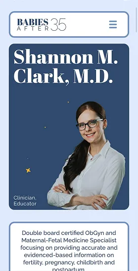
Dr. Clark, a Maternal-Fetal Medicine Specialist, is very popular on social media where she actively counters misinformation.
Her previous site had outdated branding and was not set up to allow access to all of her articles.
Design Concepts
After a thorough review of the current site and an exploratory conversation with the doctor related to what is working/not working with the old site, what she likes/doesn’t like, and what she has in mind for the new site, I then did a deep dive to see how other doctors are presenting themselves online.
Visual Direction
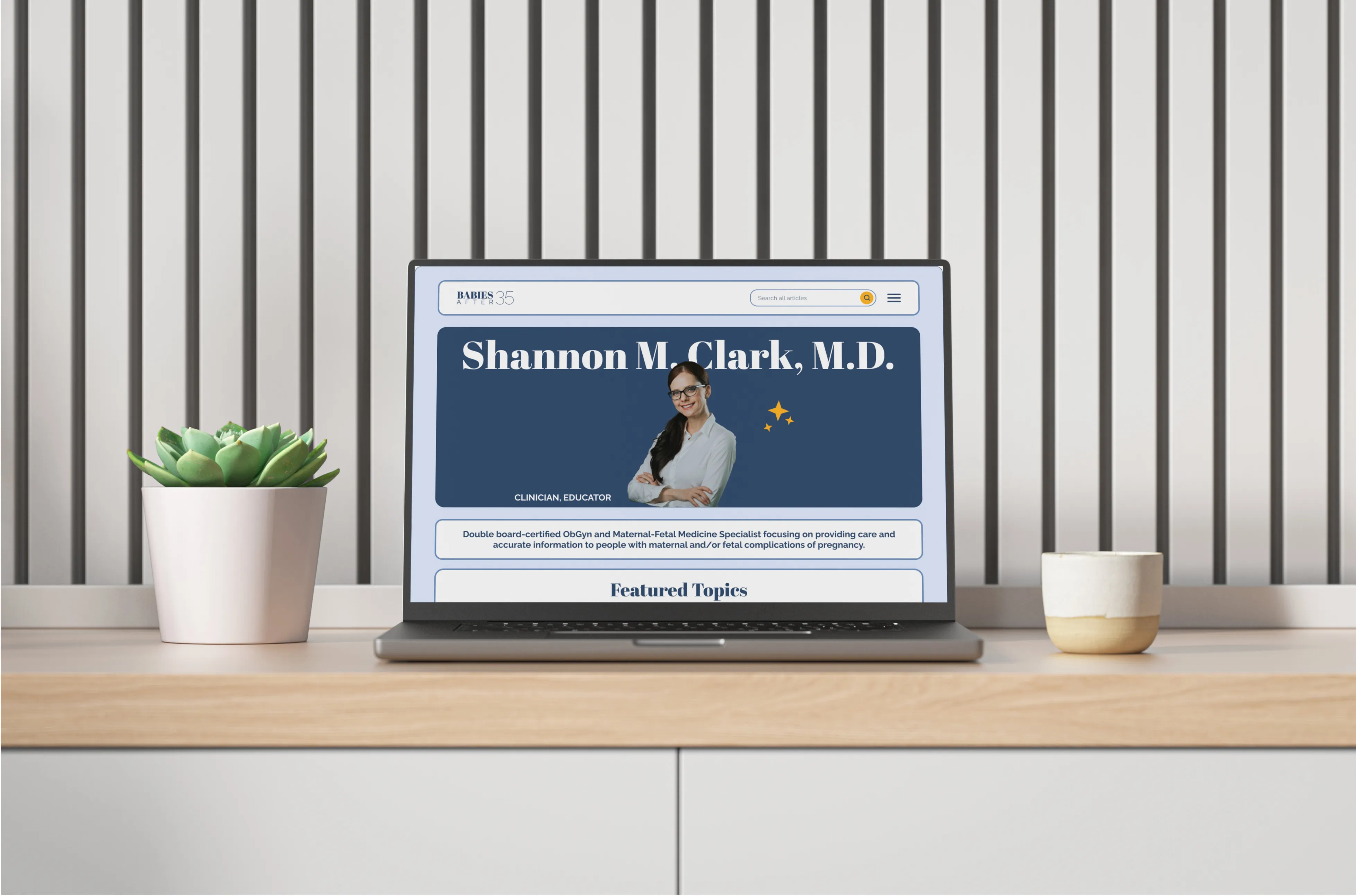
The client wasn’t sure if she wanted her image in the hero section, so I chose to show her four possible design directions, two with her image above the fold and two without.
Conservative
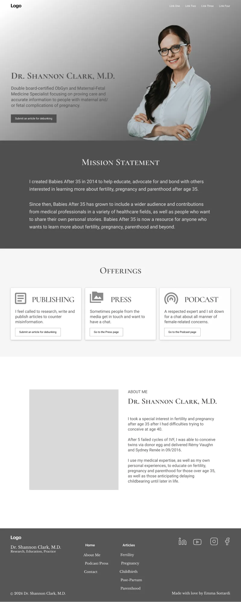
I LOL'd when she blurted "No!" as soon as she saw it.
Bento Box
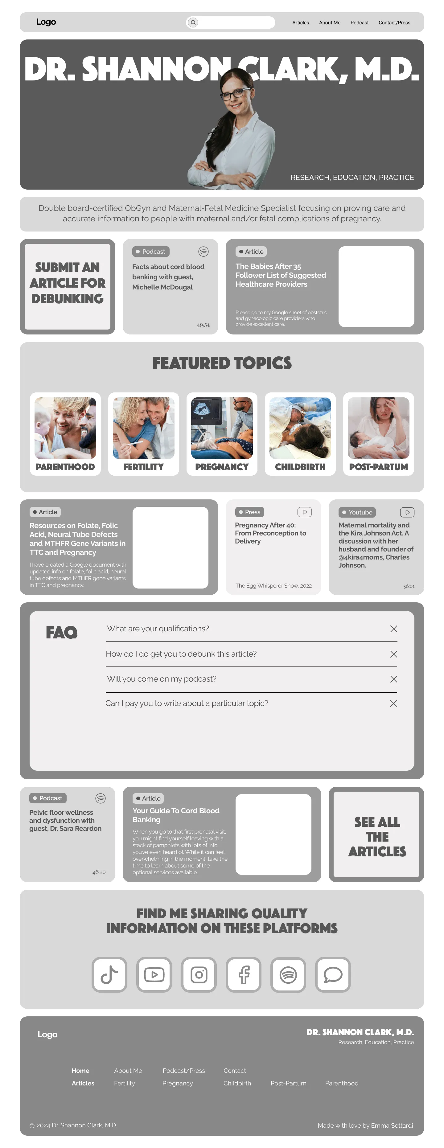
This is the design the doctor chose in the end.
Utilitarian
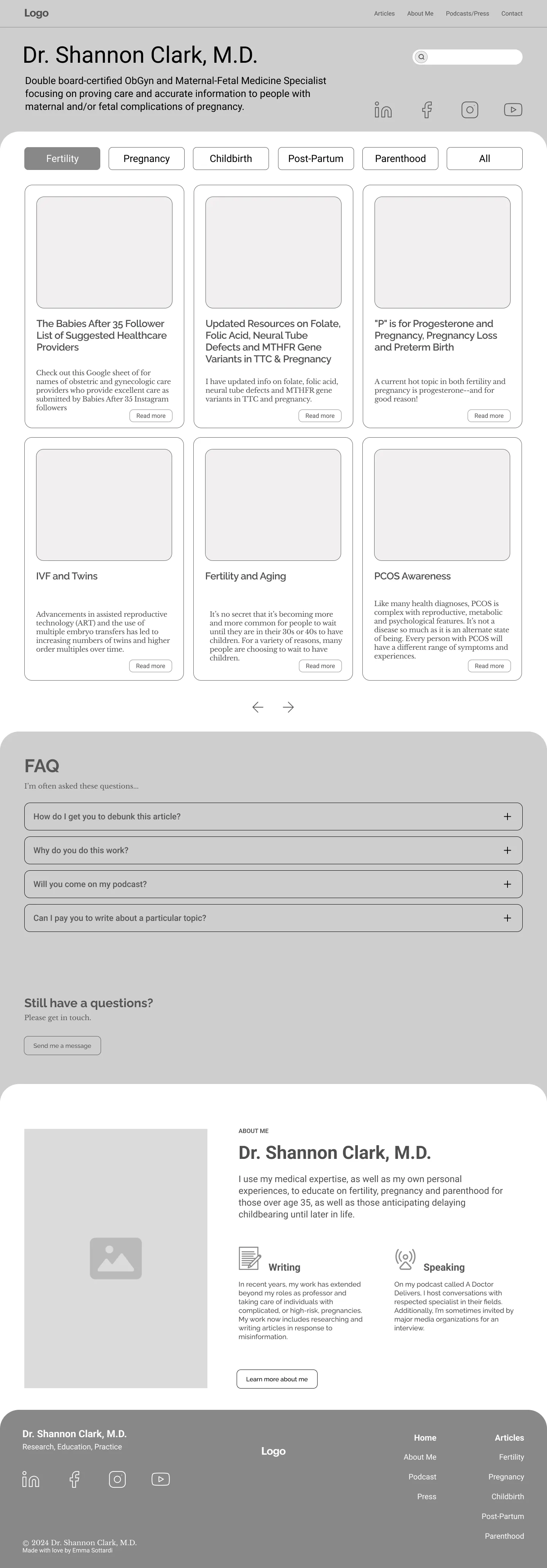
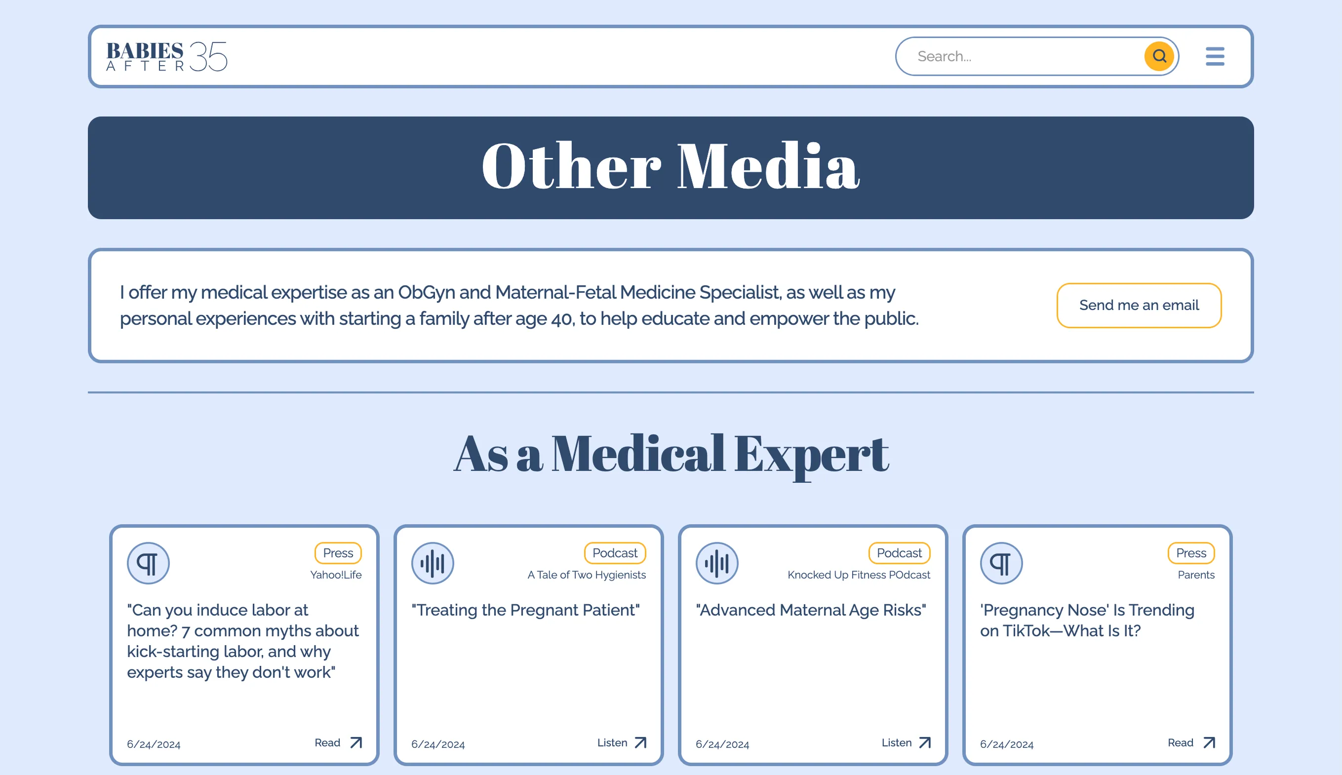
The search function right on top of the six most recent articles puts the focus directly on the articles.
Graphic

The client didn't like this style but loved these icons, so we agreed to use them with the Bento Box style.
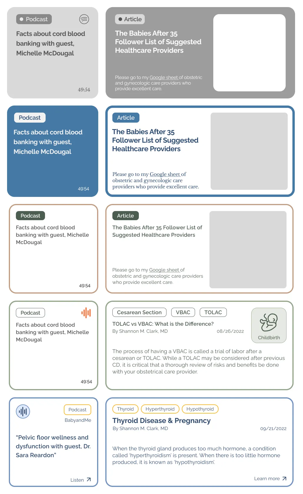
The evolution of the cards
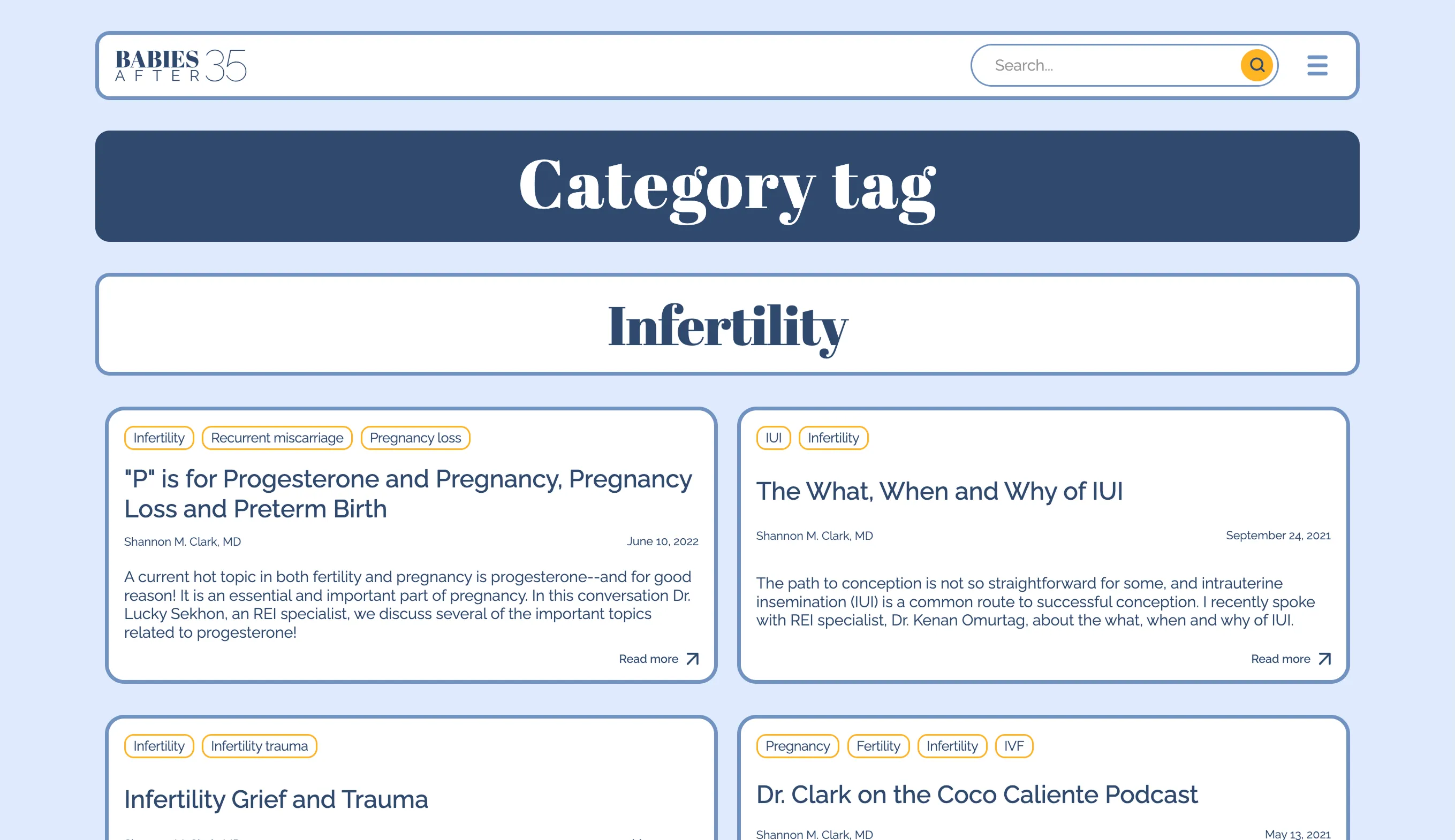
In the process of finding the right color palette, I tried all kinds of schemes for the spacing between boxes, and the cards took many needed steps toward practicality.
I would have preferred the cards not have an arrow or extraneous words, but with testing, I understood that not everyone assumed the cards are clickable, so a CTA and an arrow were added. An underline gets drawn on hover.
In the end, people expected the entire card to be clickable, so I enabled that.

Meet the new brand
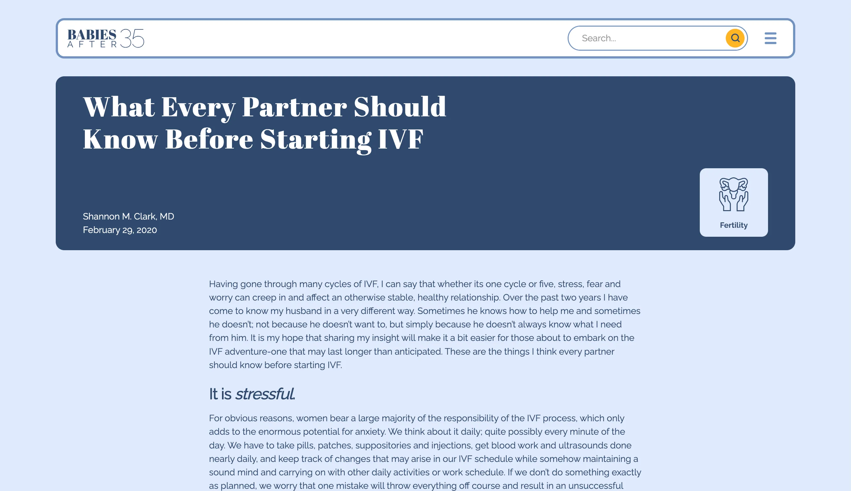
I gave the doctor an updated brand identity with new color palette, typography, and logotype that is professional yet approachable.
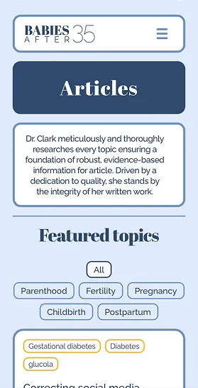
Additionally, I created custom icons for the 5 main topics of articles.
How I Met the Brief
Information just a click away
I was aware that the sheer amount of information on the site could easily be overwhelming so I leaned into uniformity.
Two sizes of cards were designed to be packed with information yet easy on the eye.
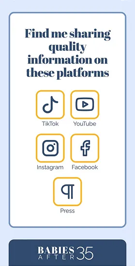
Access to all social media output in one place
I used Elfsight widgets on the site to pull in her TikTok, Instagram, and Youtube feeds.
Access to the search bar is of primary importance to the client
Her area of specialty has very specific terminology which makes the search function essential.
The search widget is open on the top of every page.
Mobile Screens
Desktop Screens